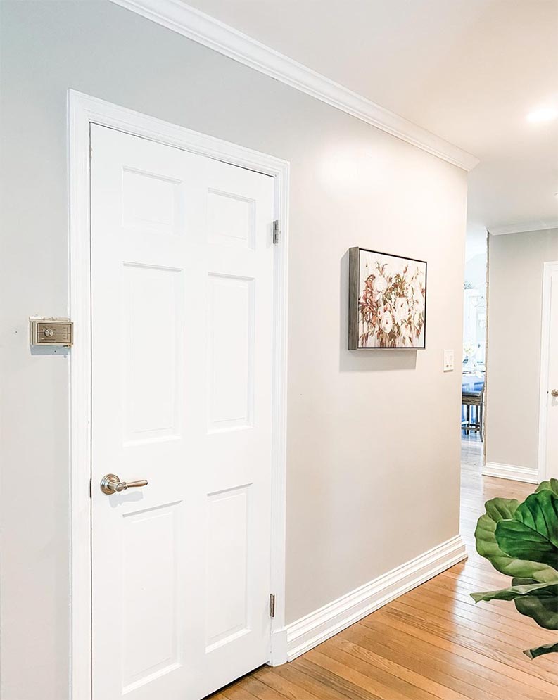
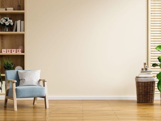
Sherwin Williams Repose Gray Color is a very popular paint color choice among home designers and homeowners. This paint color is a famous paint color from the company called Sherwin Williams and got a lot of popularity and is continuously falling as best seller paint year after year.
The reason for the popularity is that the repose gray color has soft violet and a bit of green undertones in it. The repose gray color has a Light Reflectance Value (LRV) of 58. That means that this paint color reflects an average amount of light. Choosing this color for your house can be a good option, but if you are still confused about then forget your worries.
We brought you a review on Sherwin Williams Repose Gray Color; besides the review, we will also discuss the advantages of these colors so that you can get rid of the confusion on picking this color.
Why Sherwin Williams?
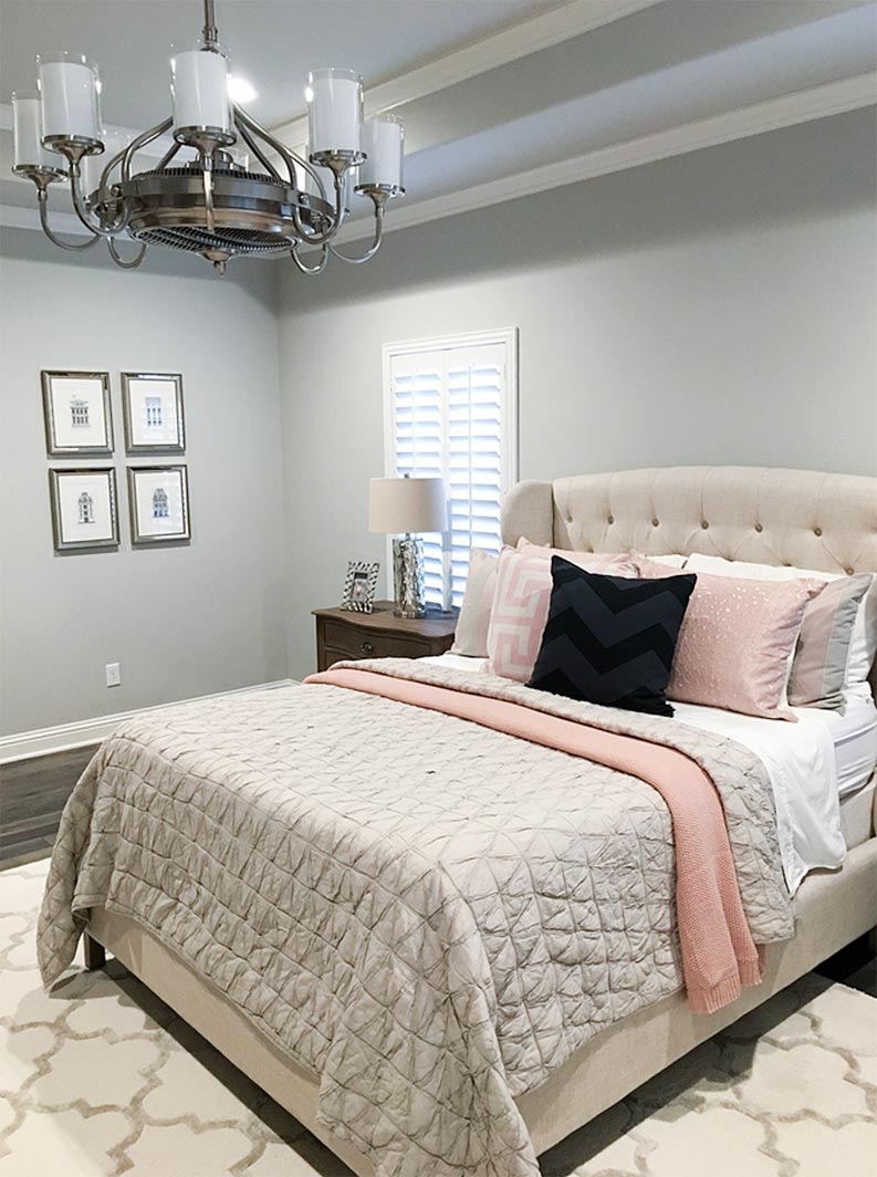
Repose Gray Color is a color from a paint company called Sherwin Williams, which became one of the best-selling and popular colors of Sherwin Williams due to its various features like versatility, neutral undertone, appeal, and many more. Sherwin William comes in the greige category, which is a combination of gray and beige tones.
This means that it has a delicate balance between cool and warm tones, which makes it a versatile choice for a wide range of design styles and color schemes. You can use this color in your house, rooms, or space easily without any second doubt. After including this color in your room, you must keep some factors in mind, like natural and artificial lighting of your house or room, textures, accents, and furniture.
1. Lightning
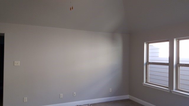
As mentioned above that Sherwin William Repose Gray color is having LSV of 58, which is an average LSV. So, a room with a good amount of light can do justice to this color and can increase the impact of the color.
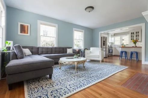
You can use artificial light for the cause, but I would always recommend that the natural is better, and usage of it can help highlight the color undertones and create a brighter atmosphere. At the same time, the dark room will not be able to do that, which justifies the reason for using a room with good light. You can take notes from the above picture and see how a repose gray color looks when there is no or negligible light in the room.
2. Contrast
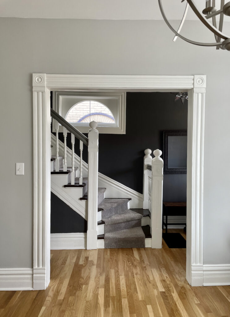
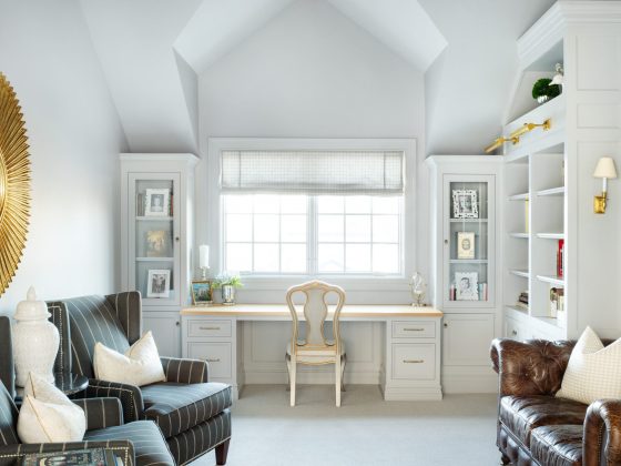
Not only repose gray if you are using any kind of paint color in your house, then you must consider your surroundings. This can include furniture, accessories, etc. This will help to enhance the overall aesthetic of the room. Using light-colored furniture must be in preference when your choice is reposed gray color.
You can also include trims and accessories that will create a sense of depth and visual interest. This will increase the aesthetic and create a beautiful backdrop that will make your room lively.
3. Textures
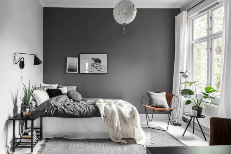
Adding different textures will increase the beauty by ten times. Here texture means the addition of materials that have different tactile or visual quality than the smooth, flat surfaces of painted walls.
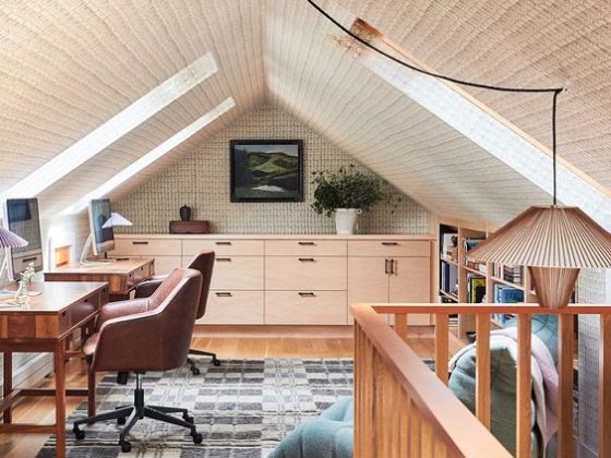
You can add textures like plush rugs, woven baskets, or textured wallpapers, which will add dimensions and will give a cozy atmosphere to the room. A light-colored texture will be an ideal choice for textures.
4. Accents
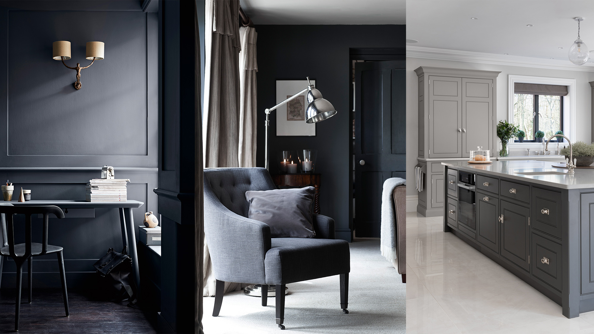
Accents refer to beautiful decorative items that can be added to the room. Accents are of various forms, like pillows, throws, rugs, artwork, curtains, and antique pieces; also, you can include some bold furniture.
They can be of different light colors that go well with the contrast, and also make sure that it complements the main color, i.e., the repose gray color. You can also show your creativity here and place accents according to your choice and room. During the process, make sure that the color blends properly.
5. Furniture
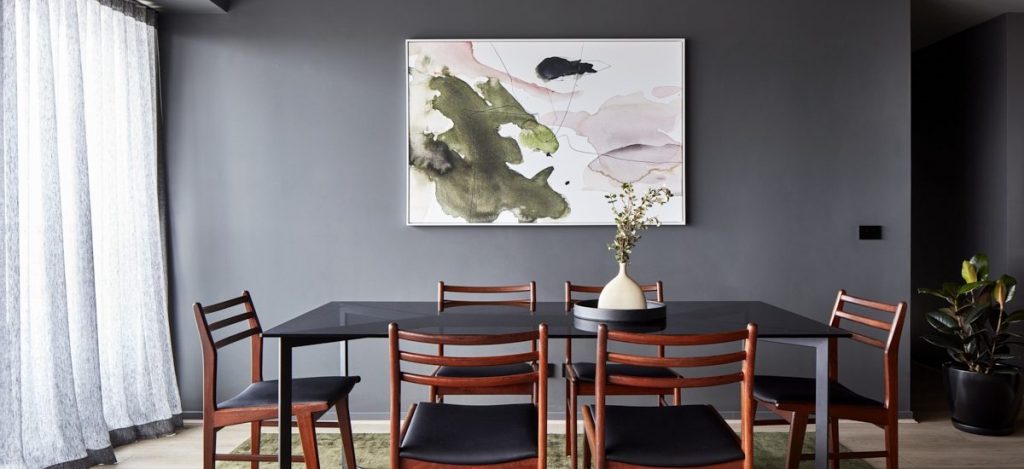
William Sherwin Repose’s gray color is highly acceptable for different furniture or decor styles. It doesn’t matter if it is a contemporary, traditional, or transitional aesthetic; this color can seamlessly blend with various furniture and decor styles.
You can select furniture by taking the theme and color of your house or room into consideration. You select the furniture that suits or fits well with your taste or theme. Here we are talking about repose gray color so you can choose the furniture that fits this color; this will make your place more beautiful and visually pleasing.
6. Functionality
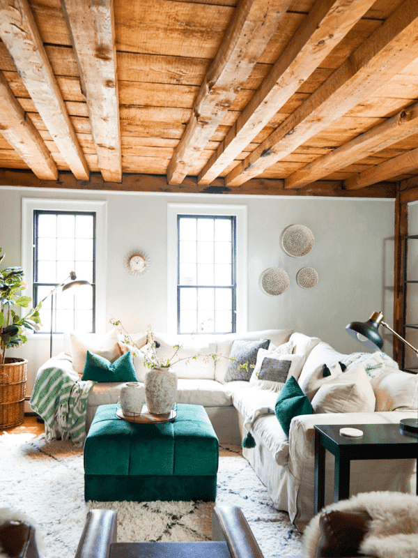
The functionality here describes the nature of the repose gray color in various rooms, including the condition of the room. For example, in bedroom William, Sherwin’s repose gray color creates a serene and peaceful environment that is conducive to rest.
This same color provides a soothing backdrop for socializing and entertaining in the living area by aligning the color choice with the intended use of space. By aligning the color choice with the intended use of space, you can create a cohesive and harmonious atmosphere.
Characteristics of Sherwin William Repose Gray Color
Sherwin William Repose Gray Color is a paint color with a distinctive set of characteristics that have contributed to its popularity among house designers and homeowners. Also, if you want to know everything about this color, then having a certain knowledge of characteristics is a must. The main characteristics of Sherwin William Repose Gray Color are mentioned below-
1. Calming Nature
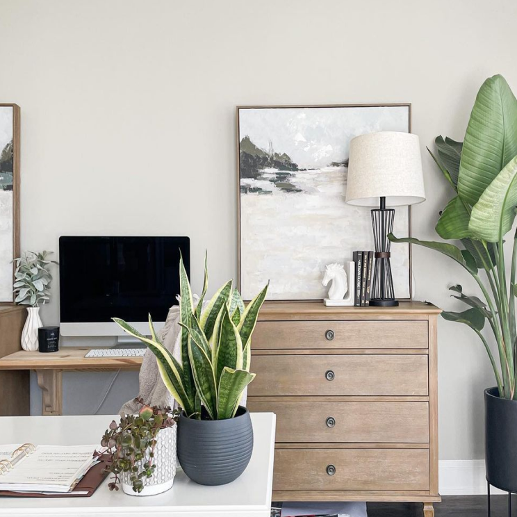
Repose gray color have a very calming effect on any place; it’s the specialty of this color that it creates a soothing and serene ambiance, while the warm undertones add a touch of coziness and comfort.
If your room has enough amount of natural or artificial light, then this color will create wonders. You can have rooms like a bedroom, living room, dining room, and drawing room. You can even paint the outdoors of your house, for example, garden walls, front yard, backyard, and others.
2. Undertones
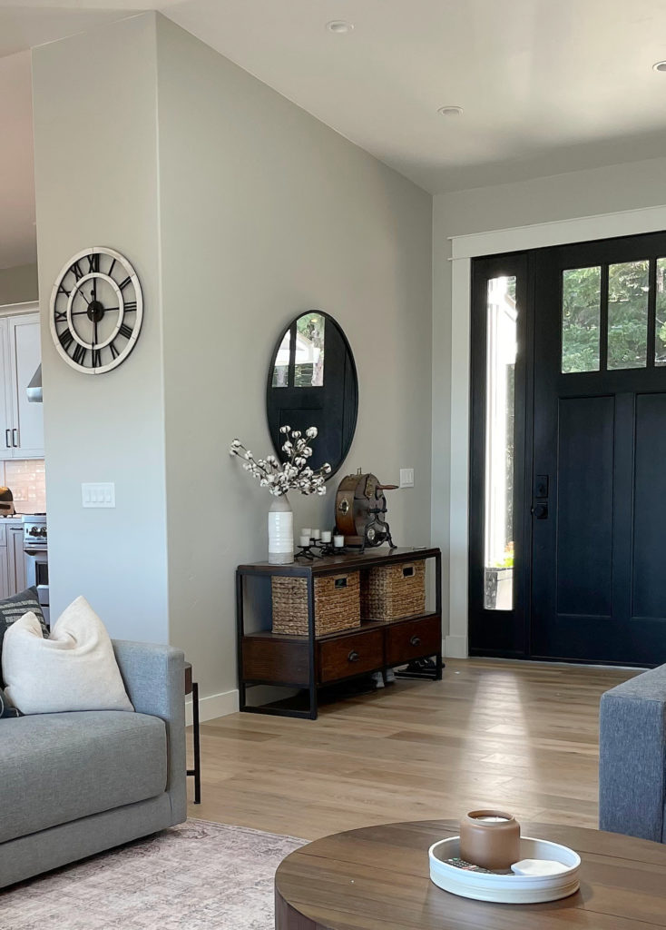
As we have discussed earlier, repose gray comes under the siege category, which means it combines gray and beige. The undertones of the repose gray color are very calming and soothing.
One of the colors of its undertone is a violet color which is used in very minimal quantity. It slightly leans towards gray with subtle warm undertones. The combination creates a versatile and balanced color that can work well with a variety of design styles and color palettes.
3. Versatility
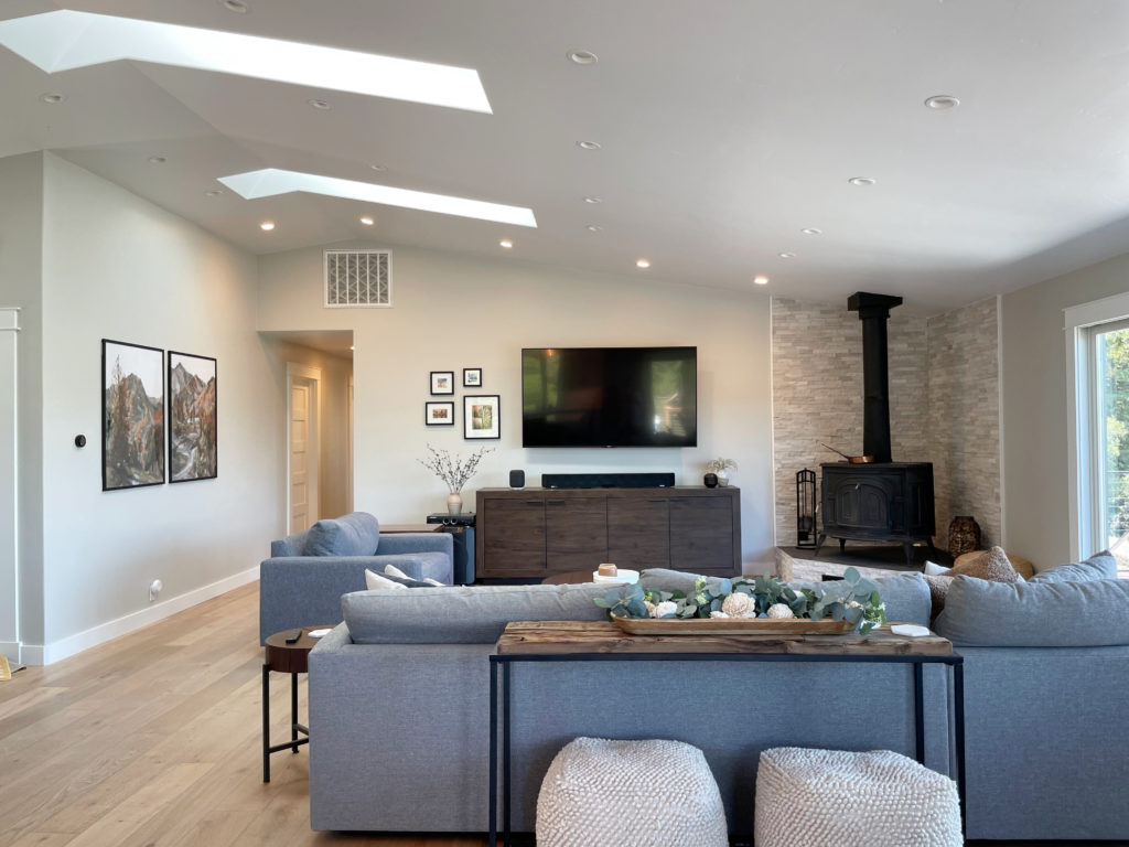
One of the popular characteristics of repose gray color that makes it stands out among many colors. It can be paired with any color easily, which gives homeowners the freedom to include the color of their choice while placing the interior.
It harmonizes with cool and warm colors that provide flexibility in designing a space that suits individual preferences, which gives you the creative liberty to combine it with the color of your choice. Some of the colors that will go well with repose gray are white, green, and dark gray.
4. Reflective Qualities
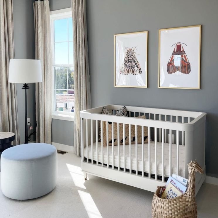
The LRV of the repose gray color is 58 and has an average light reflectance value which means it reflects a moderate amount of light. This contributes to the sense of brightness in the room. This also gives it the advantage of being more reflective toward the light.
It can also help in opening up the smaller spaces and create an airy feel without feeling stark or overwhelming. You can use this function of color for a room with a good amount of light, which will increase the beauty of your room or house.
5. Coordination

Sherwin Williams Repose Gray color serves as an excellent choice for various furniture styles, fabrics, and decor elements. It coordinates well with different food tones, allowing for seamless integration of wooden furniture and flooring.
It also pairs nicely with white, creams, blues, and even warm tones like greige. This versatility makes creating a cohesive and visually pleasing interior design easier.
6. Mood Enhancement

People say that colors can control your emotions which is true in every sense cause repose gray also has the feature of lifting the mood. The calm and neutral quality can create a sense of tranquility and relaxation. This characteristic not only provides beauty to your room or house but will also provide peace to your mental health.
In bonus, it provides a versatile foundation that allows other decor elements and personal touches to shine and express individual style.
7. Response to Light
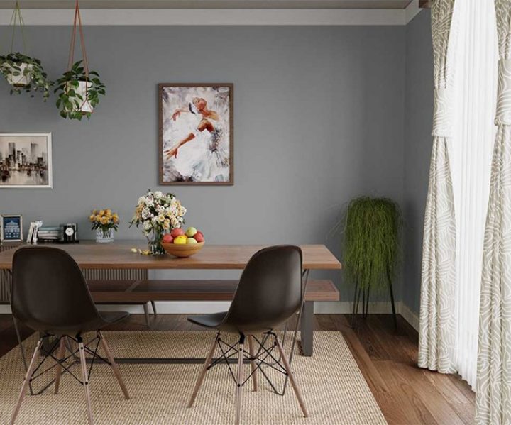
Repose gray has the quality of responding well to different lighting conditions. It can adapt and subtly shift in appearance depending on the amount and type of light in the room.
In north-facing rooms, it can appear cooler, but in south-facing, it appears on a warmer tone. The characteristics add depth and dimension to the color, making it visually interesting and dynamic.
8. Timeless
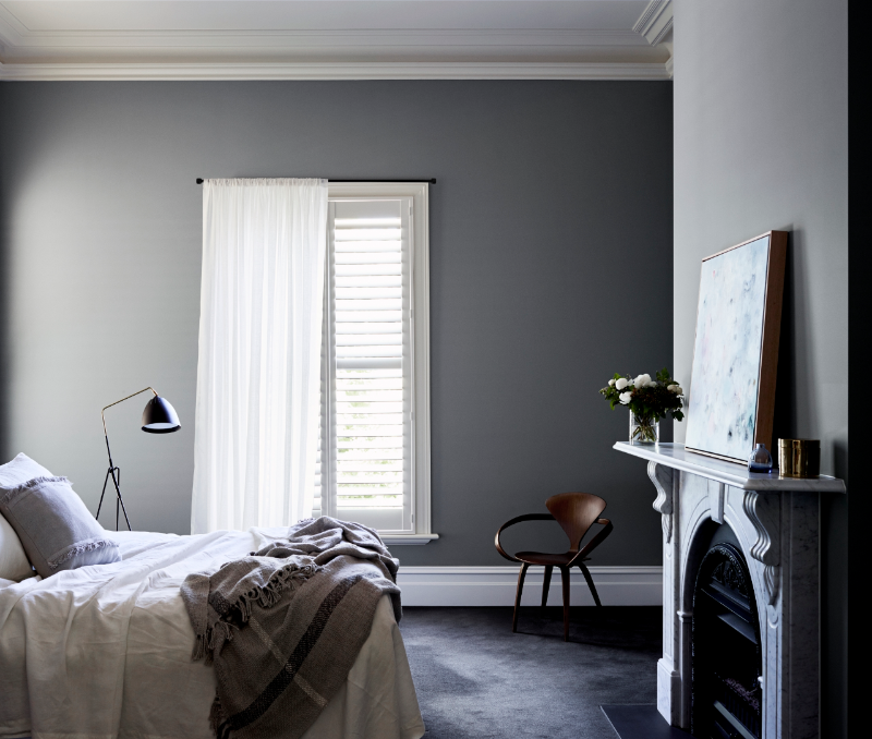
The reason why Sherwin Williams’s Repose Gray Color is timeless is because of its neutral color. This means that it is neither too cool nor too warm of a shade, making it a safe and reliable choice for those who want a classic and enduring color option.
Its neutral nature allows it to adapt to different design trends and effortlessly coordinate with various decor elements. Because of this, color will be relevant even in the future. You can also say that this color is timeless because of its simplicity.
Conclusion
Sherwin William Repose Gray Color is a popular paint color for many reasons, like its versatility, warmth, etc., making it a favorite among customers.
The appearance of the repose gray color can depend on lighting colors and the colors surrounding, so if you are going with repose gray color, make sure that you paint them where the light and other colors go well with it.
We recommend that you take a sample of the color and place it on your wall to ensure that it suits your place or your place environment.
Will you pick Sherwin Williams Repose gray color for your house? Let us know in the comment section below.
Frequently Asked Questions
Does the Repose Gray Color Go Well with Everything?
Repose gray color almost goes well with everything, which is why it became popular. Repose gray color has the quality to make everything look good, irrespective of home style, lighting, or accents. This color is a warm color inviting color which is not sterile or harsh. Though repose gray is a neutral color, it does go very well with neutral color palettes that keep the look simple.
What Colors Go Well with Repose Gray?
Though repose gray is versatile, it goes well with almost every color. But some of the best options that can take into consideration are pure white and charcoal gray, and some deep shades like navy blue, dark teal, dark brown, or green go well with repose gray.
Is Repose Gray a Calming Color?
We can say that repose gray is a calming color because of its soft, neutral color and nature. The combination of gray and beige tones in Repose Gray gives it a soothing quality that also gives a sense of relaxation. Making it a popular choice for bedrooms, living rooms, or other rooms of the house.
Is Repose Gray Good for a Dark Room?
Though repose gray is versatile, it will not go well in a dark room. Cause dark room demand a high LRV color, and repose gray colors have an average LRV of 58 which will not suit the room and the environment.


