Sherwin Williams’s color of the year 2023 has the timeless elegance mid-tone. The experts have given 40 colors from their full line of Colormix Terra collection; obviously, it has a few awestruck new ones. They have named the 2023 collection theme “Terra,” and the best part is the majority of them have names related to nature.
Sherwin-Williams is a prevalent company in paint production and distribution. They offer a wide spread of paints both for interior and exterior surface options, including ceilings, trim, and furniture. This company intensely focuses on sustainability and aspires to produce environmentally friendly products.
Explore the colors from the Terra, the four separate palettes, and the color of the year 2023 from Sherwin Williams with the combination of colors that can be combined with that in this article. This reputed company has its specialty to discuss a lot.
Sherwin Williams, The Terra
Sherwin Williams has developed 40 trending colors spread over 4 palettes. This depends on nature and space, which they have named,
- Biome
- Lore
- Nexus
- Origin
Biome Palette
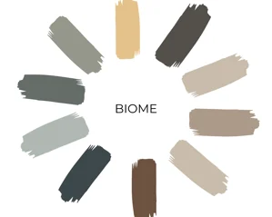
Biome is the first palette with the first ten colors. This palette consists of the essence of the earth and the sky. Every color in this depicts the extensive wilderness and consciousness of the world. These were formed to preserve the peace in the atmosphere. The colors in the biome palette are,
- Urbane Bronze sw7048
- Threshold Taupe sw7501
- Evergreen Fog sw9130
- Homburg Gray sw 7622
- Antler velvet sw 9111
- Shiitake sw 9173
- Silvermist sw 7621
- Mount Etna sw 7625
- Rookwood Medium Brown sw 2807
- White Raisin sw 7685
The name of the color themselves says about the touch of nature, for example, fog, antler, raisin, etc.
Prospects Of Choices
A room with calmness and stillness is the same option for using these earthy colors. The real flavor of the sky and earth, the calming blues, grays, and greens will suit the south or west-facing rooms with direct sunlight beaming. The sunlight will give warmth to the room. The north and east-facing rooms can take the warm tones in this palette as they don’t receive the natural sunlight. These times could give the fuel and zeal which it lacks.
Lore Palette
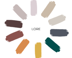
The old fashion is always the latest in trends. To prove the fact again, the old world textiles and art have taken the base theme for the “lore Palette”. This is the second in the color palette line which has a rich combination of colors. The colors are a mixture of passion and creativity.
- Studio Mauve sw 0062
- Toile Red sw 0006
- Serape sw 6656
- Nugget sw 6697
- Wallflower sw 6282
- Carnelian sw 7580
- Mineral gray sw 2740
- Blue Peacock sw 064
- Pediment sw 7634
- Dhurrie Beige sw 7524
Room Choices for These Colors
These deep colors have a connotation of drama; it’s perfect to use the dining rooms, half bathrooms, and accent walls. The bookcases and accent furniture would give a marvelous makeover. The neutral colors in this palette can be used in the hallways and foyers.
Nexus Palette
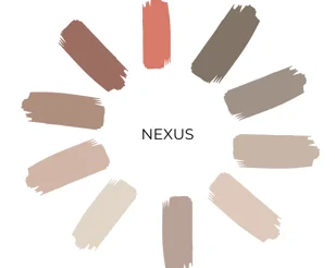
Returning home after a long journey would make us feel the most cozy and inhabitable. These are the colors with earth hues that can make you feel the same manner. This Energy packed palette is filled with natural clays, sunbaked desert sands, grounding browns and soulful whites. The 80s mauve and blues have the greatest deadlock with these colors.
- Likable Sand sw 6058
- Redend Point sw 9081
- Reddened Earth sw 6053
- Lei Flower sw 6613
- Emerging Taupe sw 6045
- Malted Milk sw 6057
- Kestrel White sw 7516
- Cool Beige sw 9086
- Foothills sw 7514
-
Chatura gray sw 9169
The Colors in This Palette Suit For
Can you think of a color that would suit any type of room? And making it the most gorgeous of all? It’s the neutral warm tones of the Nexus Palette. Especially the Lei Flower, Foothills, and Reddened Earth can give an amazing standout look to the room when they are used as an accent color.
Origin Palette
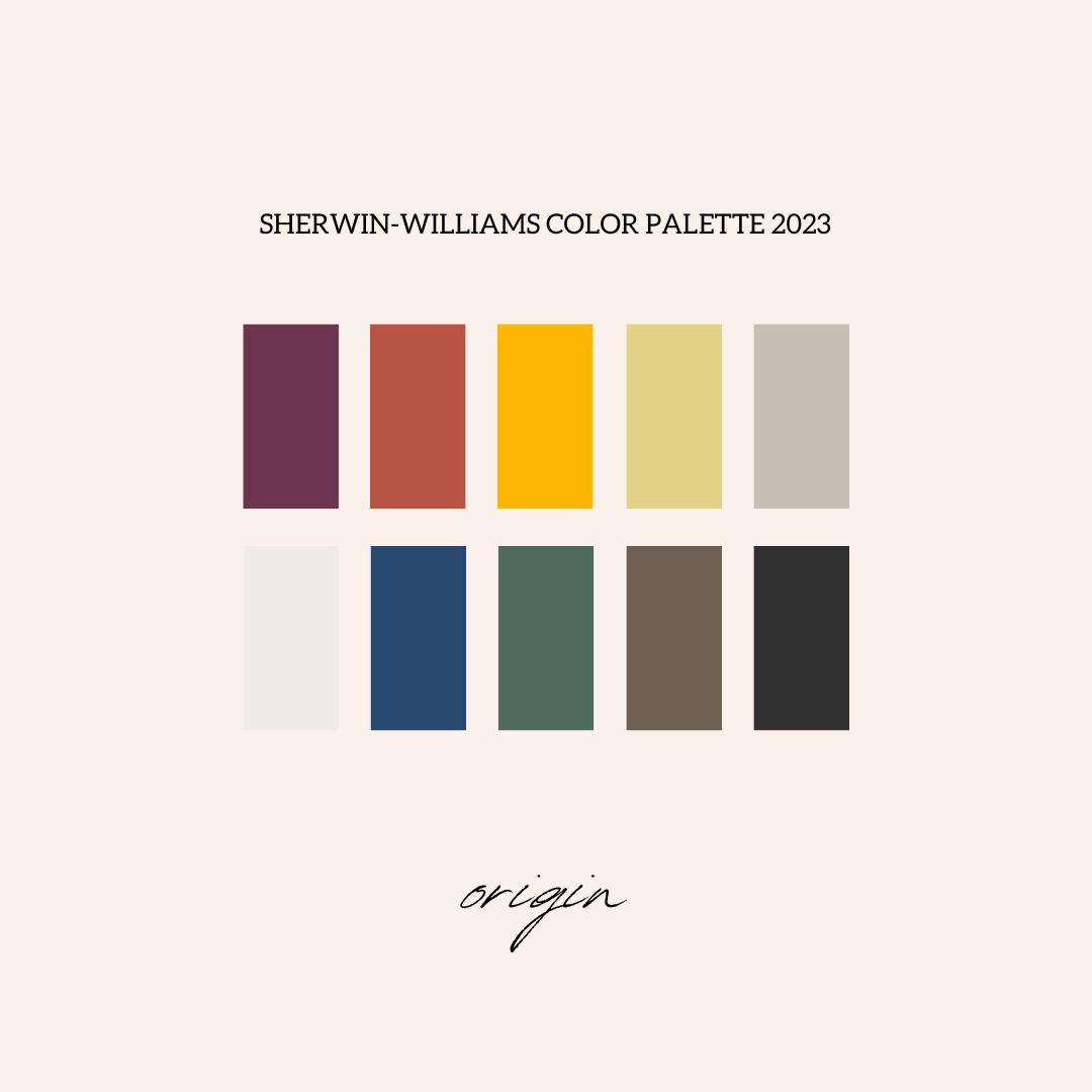
The last on the list is Origin. It holds the whole magic and mesmerizing memories of the future. The vibrancy is created in the present with the memories of the past and hopes for the future. It’s kind of recharging yourself with the free-spirited cheerful colors and a whisper of the neutrals. You can say this is a bold palette as it holds white and black with primary and jewel tones. The bright and brilliant colors are,
- Fabulous Grape sw 6293
- Peppery sw 6615
- Goldfinch sw 6905
- Chartreuse sw 0073
- Skyline Steel sw 1015
- Pure White sw 7005
- Indigo sw 6531
- Kale Green sw 6469
- Homestead Brown sw 7515
- Black Magic sw 6991
Choices for Your Concern
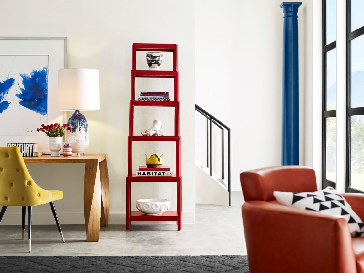
The boldness in you can choose this widespread bold Palette. Any type of room can take Pure White and Skyline Steel as it has the most neutral and effective theme. The boldness is always to be bold, so you can pick your choice of room to fill the bold and bright pack of these palette colors.
And, of course, the north-facing rooms can have the warm Peppery Goldfinch, and the south-facing rooms can have the soothing Indigo and Kale Green. Natural lighting is the fairy to the painting on your wall, as it can make a vast difference.
Sherwin Williams Color of The Year 2023
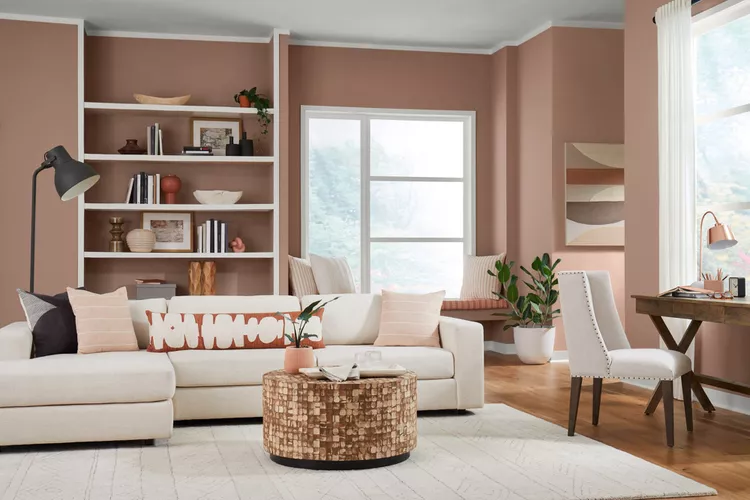
Sherwin Williams announced their color of the year 2023 by last October. It had a huge impact everywhere as it has the capability to spin and seize us with the warm modern mauve. This timeless, elegant shade has a pink undertone with the most blushing romantic eyes for the year 2023. The color Redend Point sw 9081 has a brimming option of beige with an earthy, warm tone.
This color is coming under the Nexus Palette by being the energy center for many souls. The inspiration here is the healing and restoration of the clay hues. When the annual meeting was held last year, they wanted to give some color with more empathy and humanity. As this subtle pink undertone has the warmth and exploration which everyone wants to feel in their home, this definitely is the right choice for the betterment of life of being good to each other.
The Color Psychology
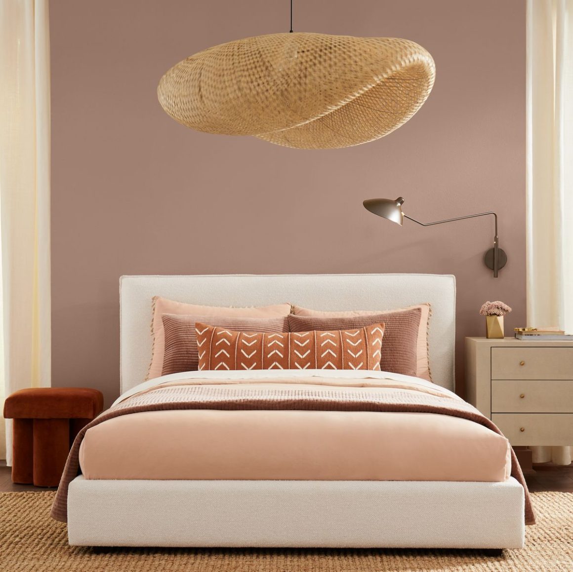
Pink is a color more involved with romance and love, and of course, sometimes tenderness and empathy. Pink can make you go neutral when you decide to stay calm. It helps to soothe your nerves to save your energy. Other than romance, this earthly pink shade has natural serenity and wellness. This is proved with all types of mental health apps as they have different shades of this mauve pink which gives you calmness with a subtle touch of brimming romance in contrast.
Wadden says that the natural neutral versions of greens, blues, and Browns are making our stay grounded or bonded to the ground always. This time the Sherwin Williams color of the year 2023 has the effect of reassuring and familiar nurturing. We never simply want to give colors to our walls. Certainly, it should have a positive impact on our lives.
How Can You Design the Reddened Point Sw 9081?
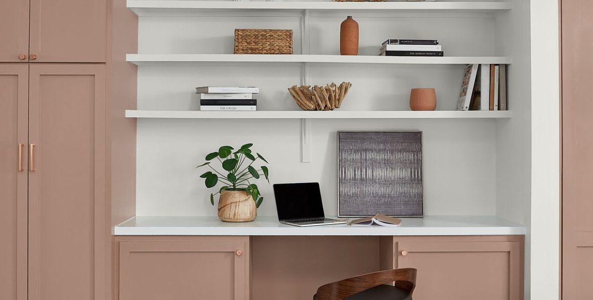
This year’s power-packed earthy tones are a direct and distinct provocation of a warm and joyful aura in any room. Choosing this beautiful color to design and organize your favorite room or your entire house can be a fun, addictive, and unique decision. The reason behind its preferences is everywhere, as you can use it for your traditional neutral home or color-filled decorative rooms.
This versatile color can be used on all four walls of your hallway to give it a warm entry or a most relaxing romantic option for your bedroom with an earthy tone. Giving it to the accent wall or a piece of furniture or painting your mudroom, everything is cool with this blushing beige.
You can use the Redend Point with your already existing neutral color to give it a spicy new makeover. It was said by Wadden that the complementing colors to go with the pink mauve are mushroom bone whites, deeper Browns, and taupes.
And the personal recommendation from them is the neutrals with a more grounding feel, such as Urbane Bronze sw 7048, Foothills sw 7514, or the clay tones like Toile Red SW 0006 and, more likely, the Malted Milk SW 6057.
Conclusion
Sherwin Williams has a reputed name in paint production because of their high quality and diverse formulations, finishes, and special features to cater to our different requirements. The products are in a wide range made by traditional methods with latex, oil-based, and specialized with every touch.
The Sherwin-Williams color of the year is launched with more expectations as the previous years were Green and Bronze in their list. They created these four palettes of forty distinct colors, each one with unique inclusions of colors, to move closer to our hearts.
Every palette depicts a unique and intriguing theme with an awesome influence of nature in it. The Color of the year 2023 is the Redend Point SW 9081. It is a beautiful beige with a blushing accent of pink in it to give your whole house an earthy warmth.




0 comments
https://hdvbdoihfh.wordpress.com