Some colors are designers’ favorites and go-to options. However, it’s always confusing to identify between Agreeable Gray vs Repose Gray. Here’s how you can crack the difference between agreeable gray and repose gray!
Now, when we are renovating our homes, and we go shopping, whether it is furniture, tile or marble selection, bathware, electric requirement, or paint color, we most certainly choose on the basis of comparison! “Will this look better or that one?”, “Which one will be more durable?”, “Is this going to be more budget-friendly or that one?”, “Which color should we go for?” – We find ourselves asking these questions because, for most of us, renovation and home makeover is a one-time investment unless you are super rich and you constantly feel the need to change something.
What is Confusing Between Agreeable Gray vs Repose Gray?
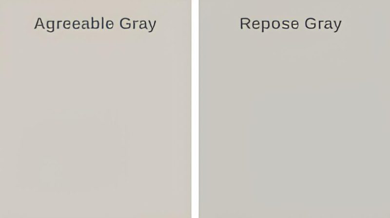
The two are almost similar; you would barely see any difference in the same light unless you put them adjacent to each other. Another major similarity is that both of these colors have a tint of beige in them and are also often termed greige paint colors.
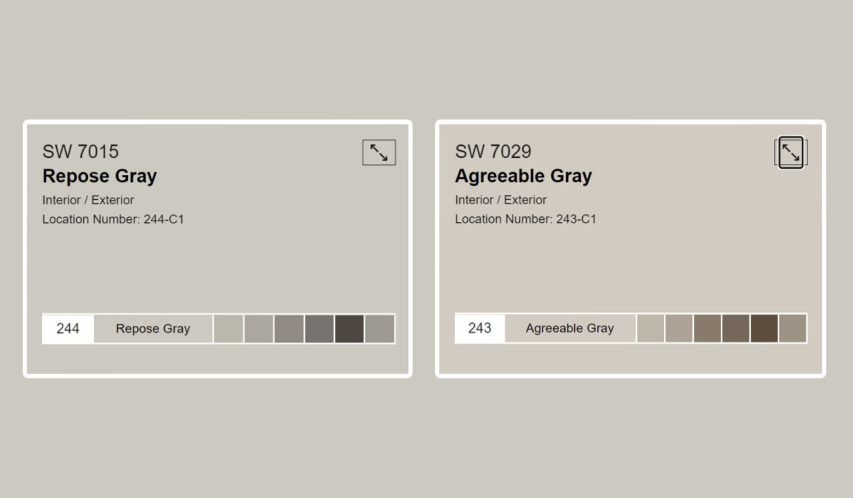
Agreeable Gray and Repose Gray are warm and will give a very cozy outlook, especially on a sunny winter afternoon! It feels so right already, doesn’t it? However, you cannot choose both for the same room, right? (Too much Gray, after all!)
What should you do? How to pick one but the best one? This brings us to our next question:
How to CompareAgreeable Gray vs. Repose Gray?
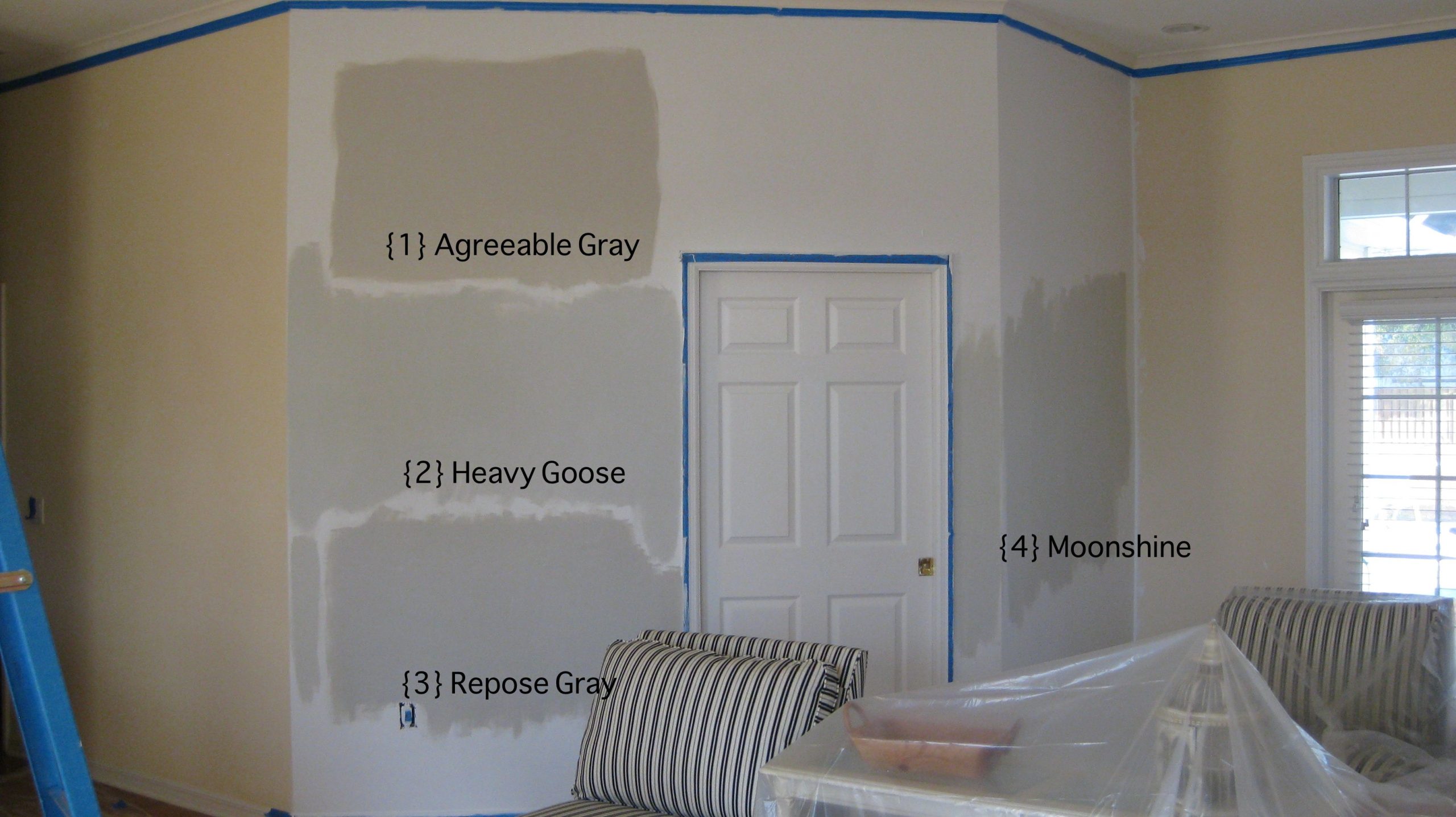
These two are different colors, and there has to be some difference! We will try to explain to you logically; agreeable gray has 60 LRV, and repose gray has 58 LRV.
- The acronym for Light Reflectance Value measures the amount of light a paint reflects. So you see, Agreeable Gray is going to be slightly brighter than Repose Gray. Now you know if you want a bright room, you should opt for Agreeable Gray because the paint itself will radiate and reflect light more than Repose Gray!
- If you’re going for renovation, we’re sure that you’ve started looking for pictures online and surfing for what’s trending these days. However, in case you haven’t, we’re slightly looking for warmer tones and something that reflects light! Now, you can make a clear choice, but we want you to make your choice and decide what suits you best. We’ll give you some more differences!
- Agreeable Gray has a lot more touch of beige, and if you are looking for a funky colorful tone, then we would suggest going for Repose Gray.
- Again, if you want the paint to go with furniture and blend seamlessly (not making furniture look out of place or you don’t wish to play bold with colors) In Agreeable Gray vs Repose Gray, Agreeable Gray is a safe option. It’s got a beige touch and suits almost every piece of furniture, giving a complete look.
- Another striking difference is that besides having a little beige, Agreeable Gray also has a bit of pink and purple, and thus, it blends easily with most colors. Whereas Repose Gray just adds a little greenish touch to the walls making it slightly less warm than Agreeable Gray! The color you pair this with plays an important role in the undertone of color to act. Like if you have a lot of greens in the room, Repose Gray will give a hint of Green itself.
When Should You NOT Buy Agreeable Gray?
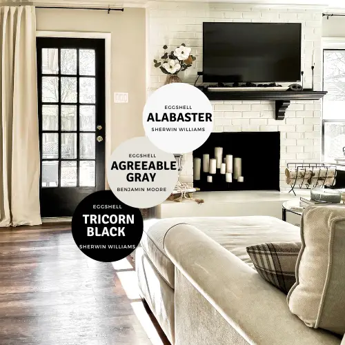
When you have fewer natural lights and a North facing room which is generally cooler, relax, we’ll explain! If you have noticed, sunlight falls on the back of the building for north-facing rooms. Therefore very little sunlight reaches the room, hence making it cooler. If your room does not have enough natural light, Agreeable Gray can look dull and flat.
If you use Agreeable Gray with other shades of Gray, it will become monotonous and difficult to distinguish between the shades. (As we said before, there is too much Gray) Why risk when you’re spending so much already when colors don’t blend together? They might look dirty! You may use shades of Gray in different rooms, but pairing it in the same room, personally, we’ll say no to it!
What Would We Prefer in Agreeable Gray vs Repose Gray?
Very often, we check Instagram, even if we purposely search for interiors or not, but when we do find interior designs, we can’t help but adore and fantasize about them. Who doesn’t want to have a pretty, well-furnished, and modern home with all facilities?
You wouldn’t believe the number of times we scroll over Agreeable Gray paint these days. Due to its greige texture, it has been trending more than ever today as we are gradually shifting to a more nude and neutral tone, even undertones, for that matter. Most people avoid pops of colors, and they like trying bright shades.
It is pretty much obvious that we would prefer Agreeable Gray any day.
- It is flexible, and you can experiment with so much while furnishing your home. Literally, any color you place with Agreeable Gray, will turn out beautifully!
- As we said, it has a tint of pink and purple (blue can also be seen under a certain light); hence it is indeed suitable for any part of your home, kitchen, living room, kid’s room, master bedroom, or even bathroom for that matter! However, it all depends on what color you pair it with.
- If you want a monochromatic look, you can use one piece of paint on all walls, but then your furniture color should be appropriate.
- Even though grays can make our homes look spacious and bigger, they can also come across as uninviting, flat, and bland. However, with a mix of beige, greige (gray + beige) is just the right shade you want!
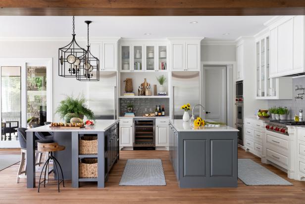
If you’re using Agreeable Gray for the kitchen, you can go all wood texture when it comes to furniture. White is also a great option, it will look royal, but it’s obviously difficult to maintain white with all the mess that happens in a kitchen.
Riverway Blue is such a sophisticated yet classy option for a master bedroom; we can’t tell you how much we drool over such rooms! Use a sample for this color alongside your painted wall; we’re sure you would like it too!
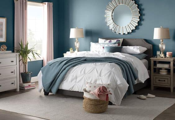
You can try colors on a beige color palette for the dining area or living area. Beige cushioned chairs for the dining area and curtains on the blue side (the aesthetic blue shade)! Go for a glass center table with black outlines and legs, along with either white chairs or Naval colors cushion chairs.
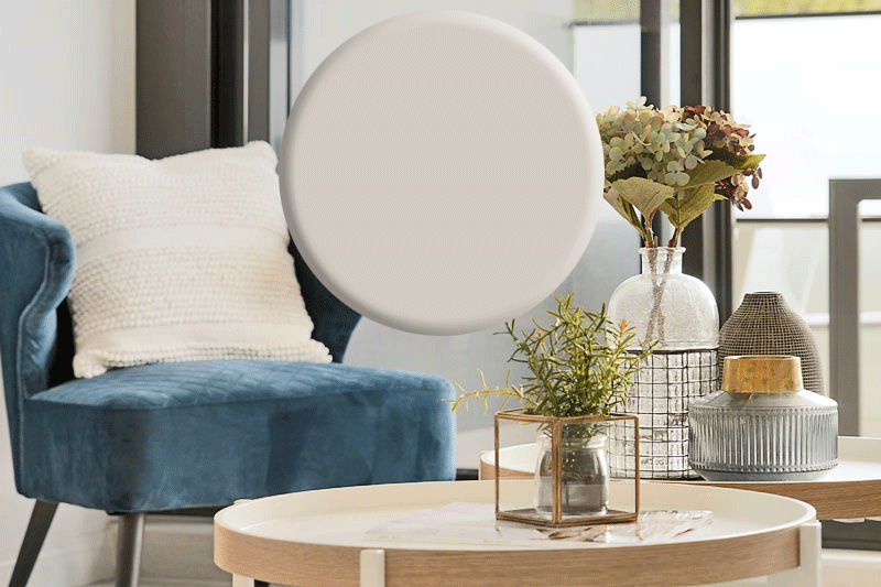
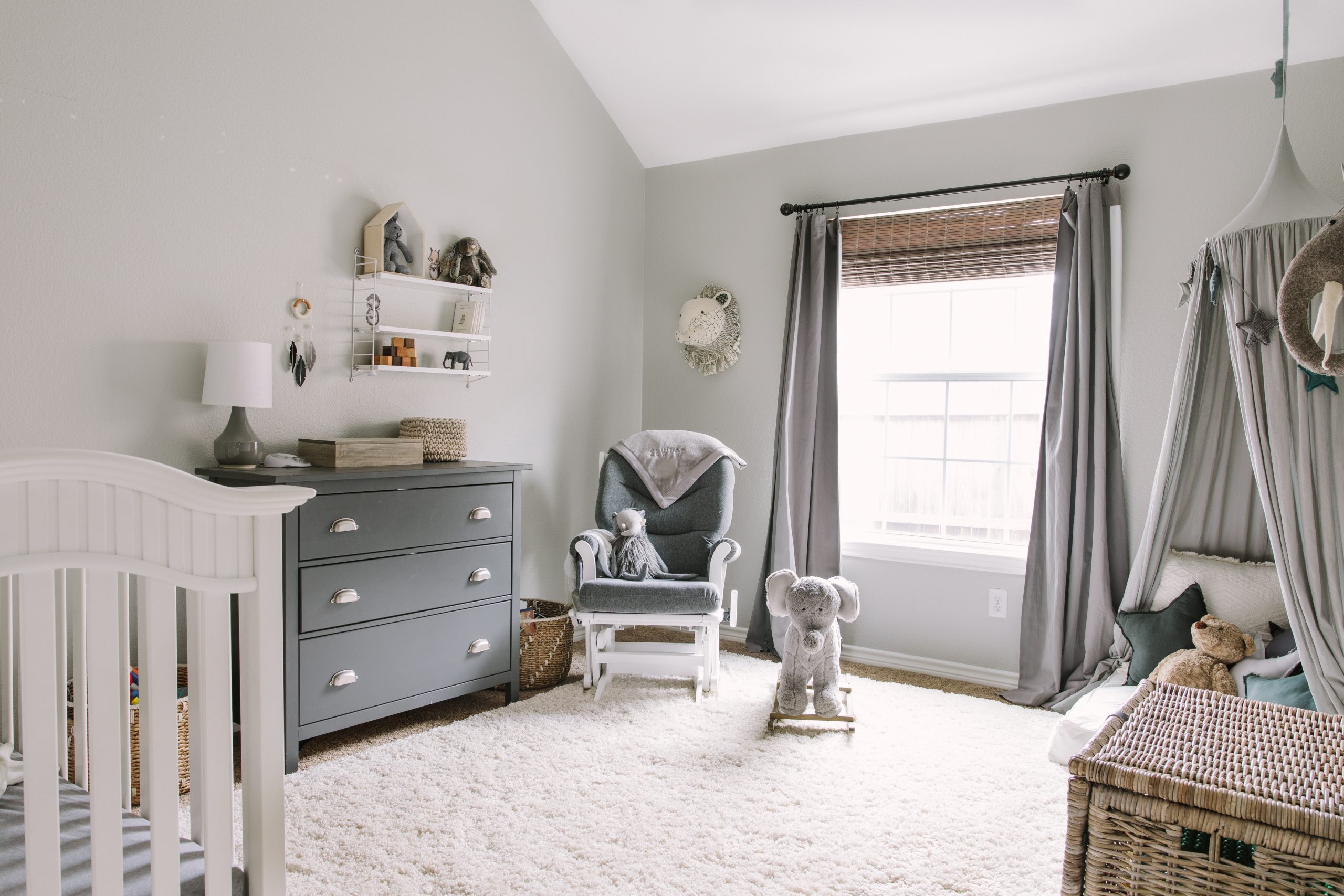
For the children’s room, you can play around with Robo Dust colors or even Coral Rose and Dusty Pink! Want to give a touch of blue, then go for the ancient colors for a superb aesthetic and vintage look. Colors like Billowy Breeze and Tidewater are also good options.
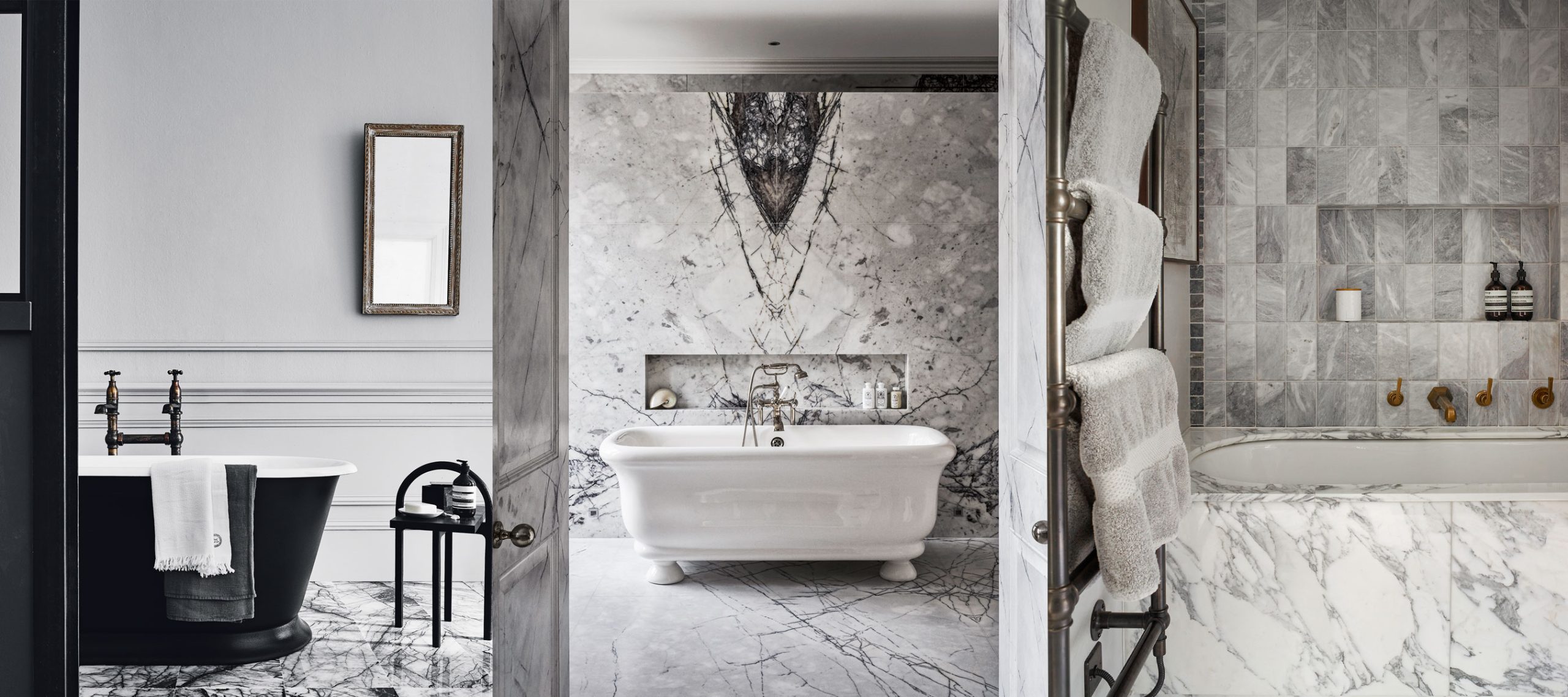
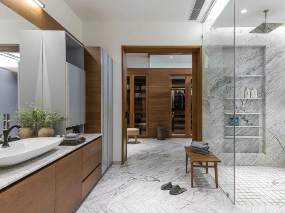
Experimenting with black is a great idea for a bathroom with Agreeable Gray on the walls. It is already a lot in fashion for restrooms; you must try vintage furniture in black. If you want to be on the safe side, go for marble-finished bathware and furniture. Trust us, they are the evergreen option, and you just cannot get bored of it!
(Remember: Always take a sample of the color, whether it’s the paint color or furniture, because colors change slightly according to the light!)
Agreeable Gray the Versatile Color!
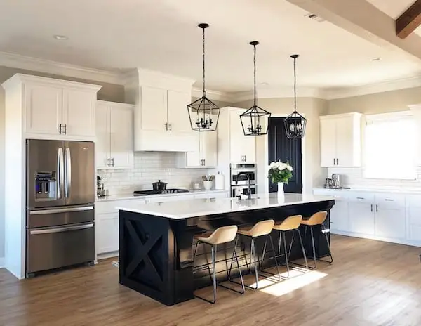
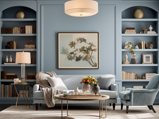
By now, with all the pictures here, you must have understood that in agreeable gray vs. repose gray, agreeable gray is such a flexible and versatile option. You can pair this with Literally any color of furniture or paint.
Suitable for any part and corner of your home, it gives a modern finish and reflects a lot of light! It makes your room look spacious and airy; it is the perfect neutral greige color. You can find shades of beige, warm white, soft white, and cream in almost every other home. What are you doing? Why continue with the old-fashioned and worn-out colors? Gray is here, and it’s here to stay!
Agreeable Gray Can Be Your Color Too!
Imagine sipping a cup of hot chocolate on a sunny winter afternoon in your living room, where you are half-wrapped in sheets! Just the cozy and right feeling we all need. After all, why would you want to spend so much and not feel at home or comfortable? Agreeable Gray is going to up your game with its classy finish and elevate the comfort of your home!
We know when you think of Gray; you think it’s dark, dull, and gloomy! Likewise, because we thought of it as well, but after trying Agreeable Gray, we were proved absolutely wrong. Gray can be warm too! Honestly, it has become our go-to color, and we can’t get over it. Trust us; agreeable gray can be your color as well. It’s the Gray that can remove the grays in your life!
Besides being the favorite of most interior designers, it can prove right for most of us. Try it for yourself, and you will want to thank us later!




0 comments
https://haaitoytgz.wordpress.com