Food is one of the greatest pleasures of life that brings people together, and your dining room provides a place where people sit and engage in beautiful conversations while sharing a meal. While each part of your home has its own importance, the dining room is certainly the most loved corner out of all of them.
One of the most significant aspects of home decor that breathes life into a space is its paint. Paints have the ability to enhance or diminish the appeal of a space. And the fact that there are so many colors does not make the job of choosing that one color that works for you any easier.
However, rest assured as we are going to walk you through a series of paint colors for the dining room that will inspire you to choose the perfect color that could totally change the game of your decor.
So, let’s get started
1. Benjamin Moore’s Palladian Blue
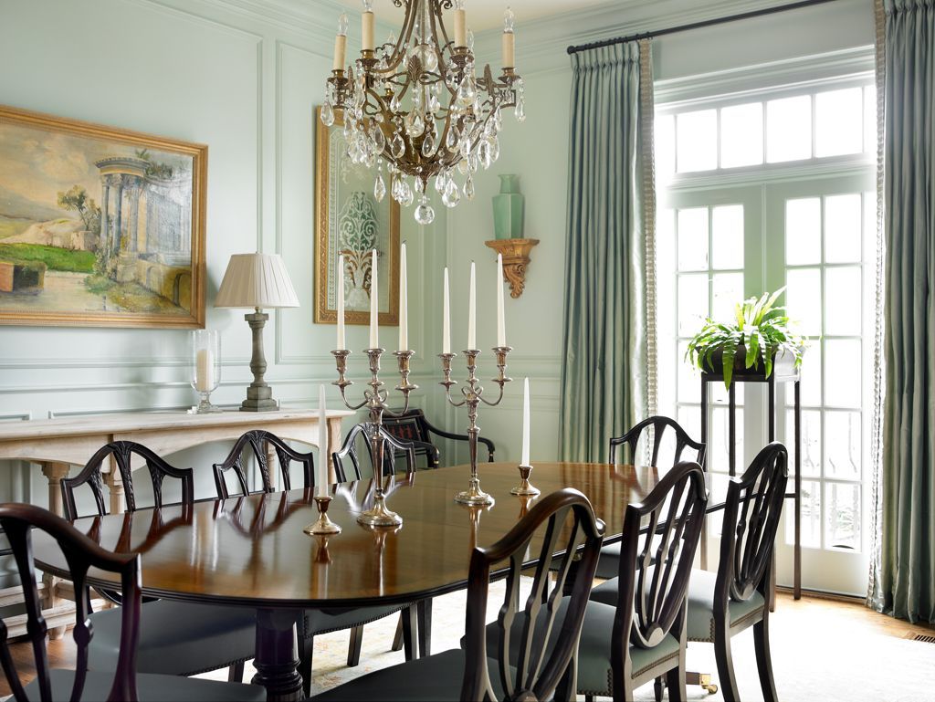
If you are looking for a stunning makeover for your dining room, Benjamin Moore’s Palladian blue is the most sought-after color trend at the moment. If you are not sure what palladian blue is, consider a soft blue-green paint that exudes a calm and tranquil charm.
Its name does not justify what it is, as the paint color leans more towards green than blue. The best way to incorporate it in your dining room is to pair it with natural wood. Palladian blue is perfect for your dining room if you get ample natural sunlight there. The beauty of this color, as Benjamin Moore quotes, is that this color is so fresh and serene that you can use it in any room of your home.
2. Shades of Gray
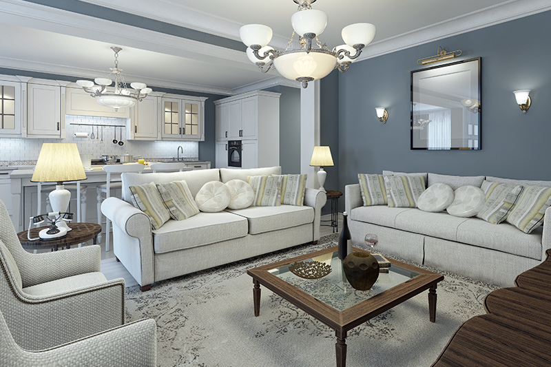
Gray is another favorite color palette for the year 2023. Its popularity has increased manifolds since 2021. It is a very calm and elegant color that has so many variants that it can be easily tailored according to your requirements. According to experts, gray is having its moment, and it’s here to stay for a long time.
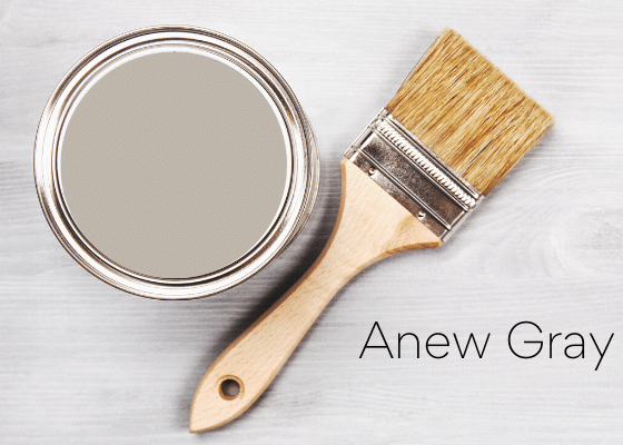
Sherwin Williams Agreeable Gray is a cool tone of gray that is quite popular right now. It offers a more subtle and timeless look that is perfect for your dining room. Agreeable gray is a greige and lies somewhere between gray and beige color.
3. Creating the Perfect Urban Dining with a Teal Backdrop
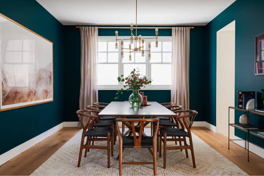
Teal may not be a great color for any other room in your home, but it is perfect for your dining area. When paired with light colors like cream and white, this color can be a true delight to your senses. It also gives your dining area a perfect urban chic look. Teal is both fun and soothing and keeps the ambiance of your room light and bright.
A teal backdrop instantly exudes calmness and makes for a perfect space for enjoying meals with your friends and family. It has the ability to make the space intimate and cozy while maintaining a sophisticated atmosphere.
4. The Beauty of Creamy Taupe
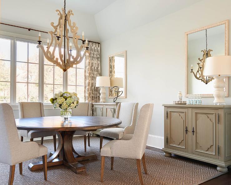
Enhance the tranquil charm of light cream-colored walls by pairing them with light neutrals like taupe to create a sophisticated and bold look. These walls act as a neutral background that allows the elements of the room to appear more profound.
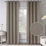
Taupe is perfect for creating a subtle classic look with a hint of modern; its timeless charm makes it a perfect color for your dining area. The cream-colored walls can be accentuated by using taupe accents like curtains and dining table sets. The combination of cream and taupe is the ultimate choice for people looking for timeless paint colors for dining rooms.
- PACKAGING: 2 panels per package.Each curtain panel measures 52" wide x 84" long (Total width is 104").Top design of 8 silver rings per panel with 1.6 inches inner diameter which makes the curtains easy to install and slide.
- 100%BLAKOUT: These linen curtains are made of 20% Linen, 80% Polyester fabric, added with completely blackout interlayer, block 100% sun lights and UV rays. Heavyweight fabric have a good sense of drape, better for thermal insulated and reduce the noise.Energy efficient design reduces energy lost through your windows by up to 25%.
- QUALITY: Good quality fabric can withstand years of use, and color and materials are the same on the front and the back. These fabrics adopts waterproof coating on both sides, fit both indoor and outdoor demand.(There may be some slight differences between the color tone of the pictures and that of the actual items due to lighting effects and monitor brightness.
- PROVIDING PRIVACY: These linen curtains offer a rich, textured linen look that will instantly elevate your home's decor.Burlap effect will bring more vintage and classic visual look. perfect for any shabby chic, modern farmhouse, country chic, rustic, coastal beach, or classic traditional style to accent windows.
- MACHINE WASH: Lab test shows the curtain panels are environmental and vinyl free Machine washable in cold water, use only non-chlorine bleach when needed, tumble dry low and cool iron as needed.
5. Complementing Charm of Lemon Yellow
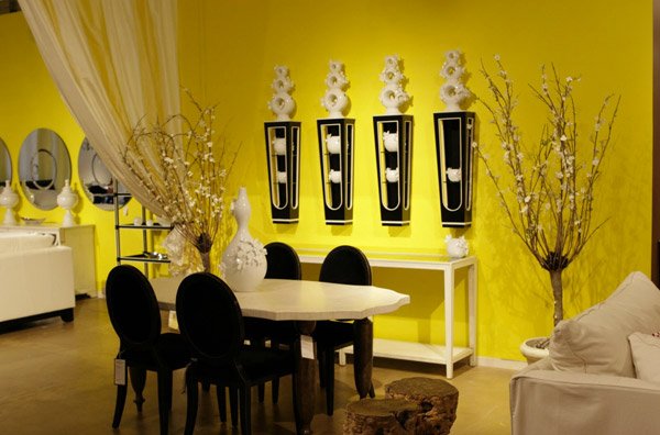
Another exciting color that is quite popular these days is lemon yellow. It is a bright, bold, and beautiful color that is perfect for your dining room. The beauty of yellow is that even an area that receives less natural light can appear brighter with this color due to its reflective nature.
It is quite an adaptable color with many hues that can complement any interior. It can be paired with almost every color out there and provides a great foundation for other colors to give out a nice harmonious look.
6. Dead Salmon Pink by Farrow & Ball
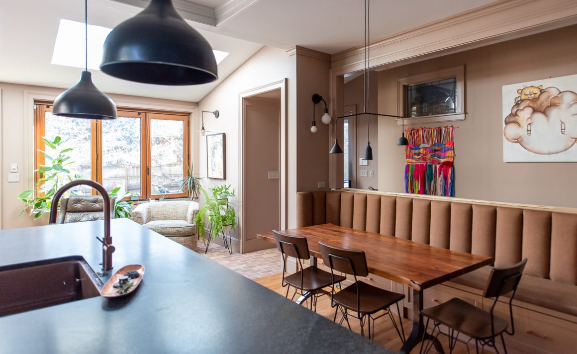
Salmon is making yet another comeback for home decor in 2023. With its deepening and subtle tinge of aged pink color, this paint color makes for a perfect backdrop for a cozy dining space. This color can evoke a vintage charm when paired with traditional accents.
Surprisingly, dead salmon pink is highly versatile and is perfect for pairing with a number of interior design styles, including contemporary and traditional. Due to its natural calming aura, this color has become one of the most preferred colors in today’s interior design.
7. Bright Blue Sapphire
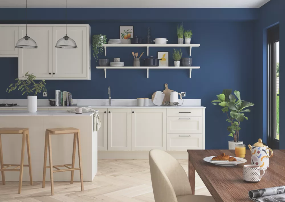
Although Sapphire is a beautiful color, it has long been overlooked in the context of interior decor. Amidst the light shades of colors getting popular these days, sapphire is making a nice comeback. Using sapphire paint in your dining can instantly turn into a centerpiece. This deep and rich shade of blue is the epitome of elegance and class.
Choosing the right furniture to pair with your sapphire dining is quite essential to bring out the whole look. Use lighter wood tones so that it can create a nice contrast against sapphire walls, and complete it with an artsy chandelier and some traditional-style cutlery.
8. Shades of Peach
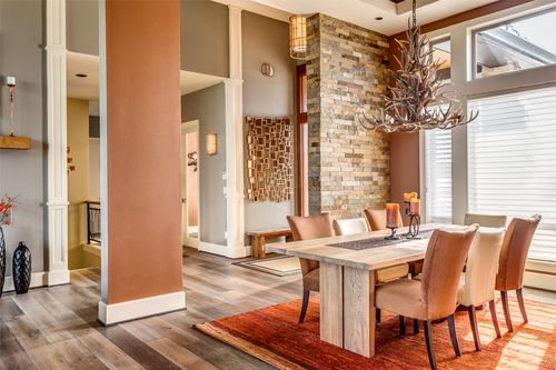
Peach is a soft and delicate color that is quite versatile. From giving your place a nice feminine and contemporary look to creating a splendid Victorian-style home, there is a lot that can be done with various shades of peach.
Consider the style and appearance of your dining area to play with the correct shade of peach. If you have a smaller space would be better to choose a lighter shade to give it a spacious look, while dark tones are perfect for creating a warm and cozy feel in bigger dining areas.
9. Rich and Sophisticated Icy Blue
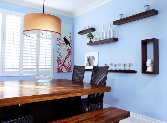
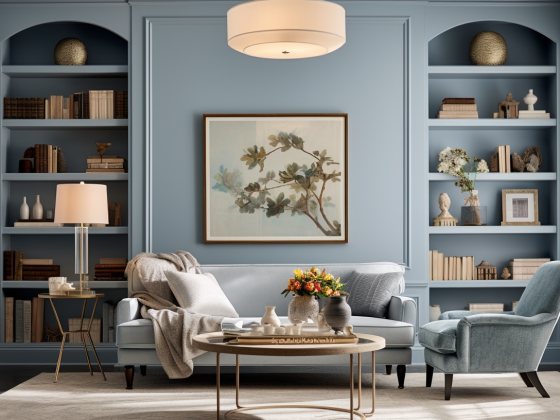
An icy blue interior gives your dining room a relaxing and refreshing vibe. It creates a calming effect on your mind, and its serene appearance is perfect for your dining room. It also complements a lot of colors and easily blends with dark tones. Dark wood furniture and yellow lights can make your icy blue theme dining appear richer and more elegant.
When choosing icy blue as your dining interior, remember to accessorize the room with complementary throw pillows, rugs, and artwork so that it appears bold and bright.
10. The Evergreen “Forest Green”
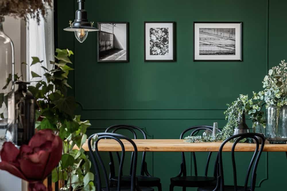
Carrying a beautiful natural vibe, a forest green dining room can prove to be a wonderful escape from the hustle of every day. If you think the buzz of green color is gone and it is not the trendiest color these days, think again!
Green is evergreen! It has been a popular choice for the interior for ages, and with its great comeback, the year 2023 has seen more usage of green tones than any other year. If you want to make a bold statement with green color in your dining, use green drapes, and choose green velvet dining chairs and dark wood tables. Not only will it create a luxurious look for your dining, but it also makes you feel at peace and closer to nature.
- 【 Modern classic dining chair set 】The regular diamond pattern is matched with classic green, and the velvet dining chair can be used not only in the dining room, but also in the bedroom, living room and so on.
- 【 Comfortable Velvet Chairs 】KEIVVAKN green dining chair seat is made of high quality padding and breathable soft velvet fabric, and the velvet chair legs are designed in trapezoidal shape to better maintain the stability of the chair.The tilt of the green chair back is 110 degrees, which is more ergonomic.
- 【Product details】Velvet dining chair overall size is 20.5 "(L) *17.3" (W) *32.6 "(H).The dimensions of the seat are 20.5" (L) x 17.3" (W) x 16.1" (H) and the height from the bottom of the seat to the floor is 16.5 ".
- 【Product upgrade】Increase the height of the green dining chair back and widen the width of the seat of the dining chair, so that you could feel more comfortable and relaxed.Adjustable foot Settings are added at the bottom of the chair legs, so you do not have to worry about the dining chair will be unstable.
- 【You will GET】4 modern velvet dining chairs, installation instructions and satisfactory after-sales service.If you have any questions, please feel free to contact us. KEIVVAKN aims to provide customers with a good shopping experience - high quality products and services.
11. Indulge in The Charm of Charcoal
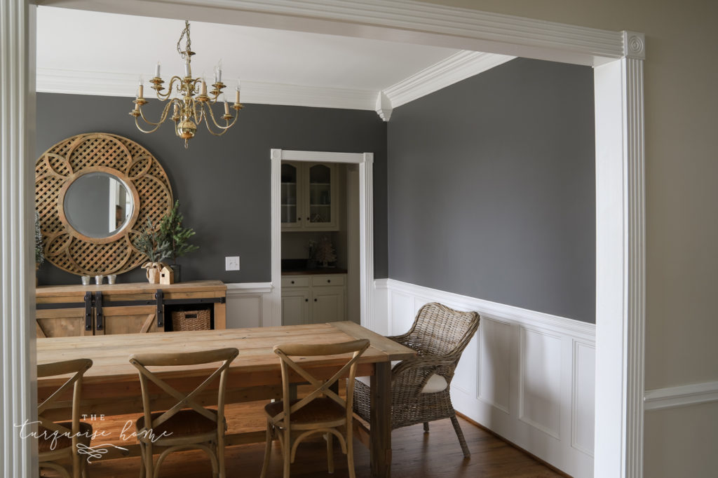
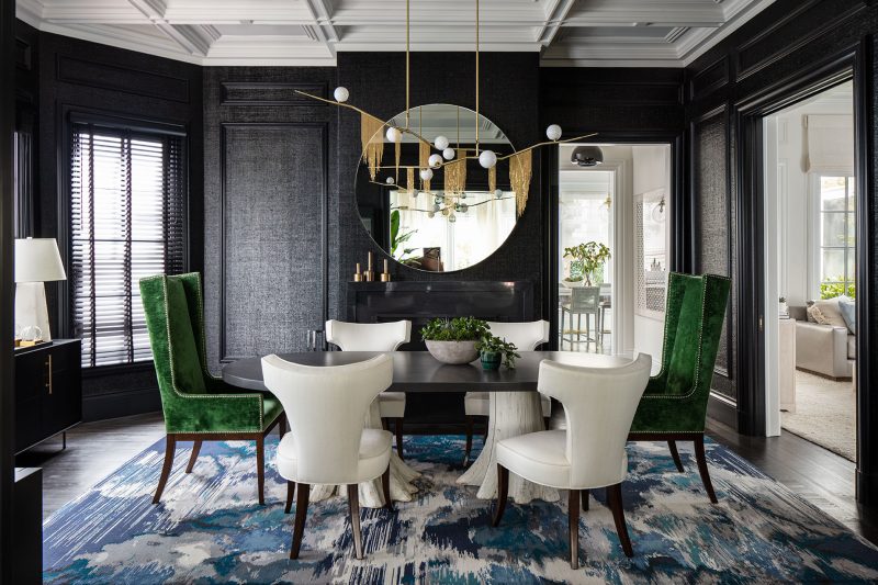
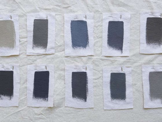
Gone are the days when charcoal color used to be boring and was hardly used in interior design. Charcoal is one of the most sought-after paint colors for dining rooms these days. It is a cool neutral color that can easily bring out accents in your dining. It is perfect for smaller spaces, as it can make it appear larger.
If you want to create a more subtle and sophisticated look, choose furniture in dark colors to highlight the main dining area. You can also make a rather contrasting look by choosing drapes in dark tones.
12. The Simplistic Beauty of Beige
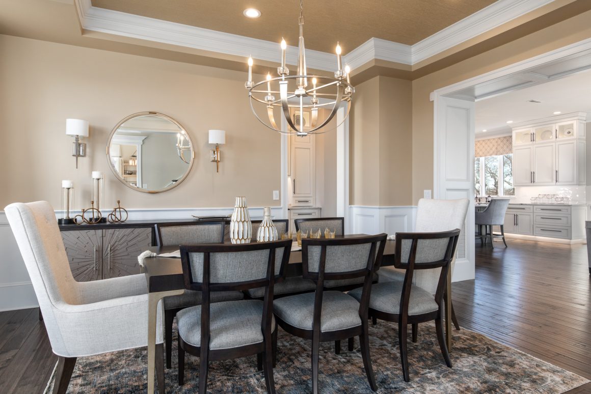
Soft and earthy shades are quite popular paint color choices for the year 2023. The soothing and timeless charm of beigemakes it quite a hit color in interior decor these days. It’s a classic color that complements a wide range of furniture and ornaments. It can be combined with bold accents as well as pastel colors to give out a sophisticated and simplistic charm.
Out of all the neutral paint colors, beige is certainly a flattering tone that makes for a stylish yet simple appearance. It makes for an elegant dining place without coming off as pompous. You can pair your beige walls with both light or dark undertone accents.
13. The Pretty Pink
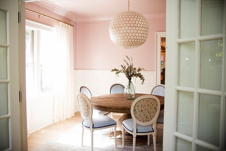
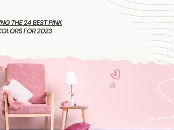
Still, think pink is feminine? It’s time to burst your bubble and embrace the newest trend in town. Pink dining rooms have emerged as the most widely used decor trend of this year. The gorgeous pink is available in a wide range of shades, from the tempting hot pink to vibrant coral; there is a shade of pink for every home out there.
It creates an ambiance of warmth and intimacy and is appropriate for both large and smaller dining areas. You can further enhance the space by adding a few feminine accents, such as soft pink cushions, rugs, and rich pink-colored cushions.
14. The Bold and Gorgeous Light Green
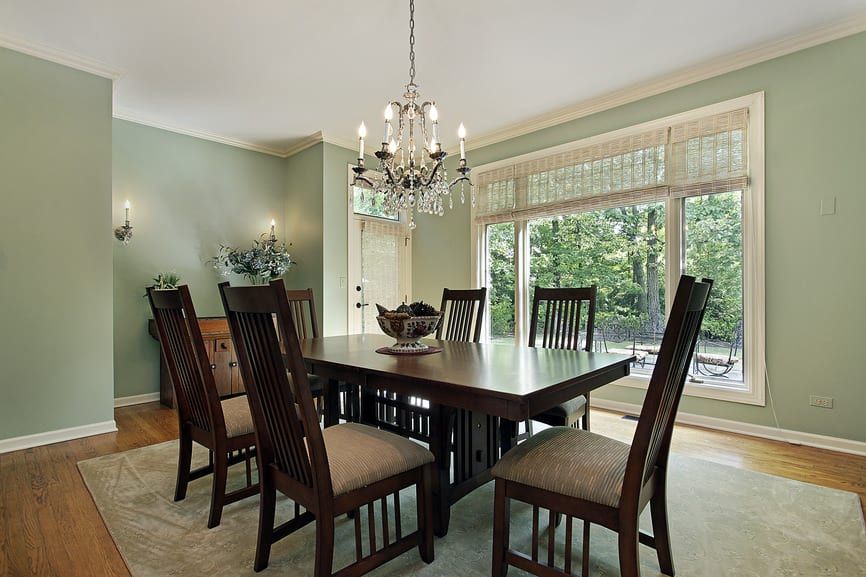
The green color is known for its calming and captivating charm. It creates a great impact and is quite an eye-pleasing color, to say the least. From the darkest green to light undertones, green is a color that should definitely be a part of your interior, be it in your living room, dining, or bedroom.
It creates a great tranquil environment, and its natural tones are so soothing that just looking at your walls for a few minutes can create a calming effect on you. Its subtle yet impactful presence exudes a sense of harmony and warmth that is perfect for creating a positive environment in your dining room.
15. The Chic and Versatile Soft White
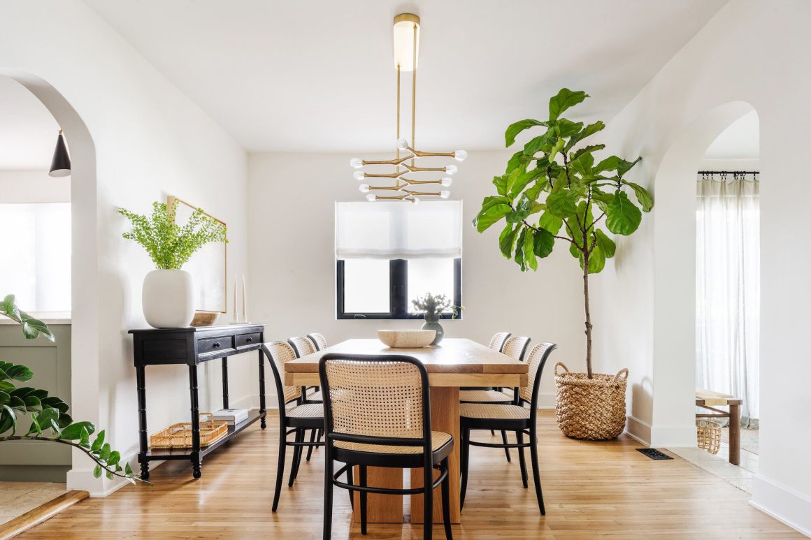
If you want to pick a timeless classic paint color for the dining room, a soft white shade is perfect for you. It helps to create an elegant and harmonious atmosphere. It’s an inviting and friendly color which makes it perfect to be used in a dining space. Soft white has this eye-pleasing aura and minimalistic vibe, making your dining space appear bigger.
It can complement traditional and contemporary home decor and makes for a nice backdrop for a range of furniture. It makes your furniture and accents stand out by serving as a canvas for their display. Hence it is perfect for dining, which has substantial elements of display.
Conclusion
Choosing the right paint color, especially for dining, is quite a crucial element of home decor, as it can totally change your dining experience. The dining room’s bright and inviting ambiance can elevate your dining experience beyond your imagination.
Through this article, we tried to walk you through several options for the finest paint colors trending in 2023. You can choose the one according to your own needs and preferences. Also, there are a few things you should keep in mind while choosing paint colors for the dining room, such as the size of the room, the provision for natural light, and your existing decor and furniture.
So, go on experimenting with these colors. We hope this guide has given you sufficient info on narrowing down your choices. Tell us in the comment section below which color paint you will choose for your dining room.


